
Graphic Design terms and principles in Web Design - How to design a great looking website
I’ve been watching from the sidelines just how graphic designers have been transitioning from print to website design. Many have experienced challenges in perceiving the new canvas, that is, designing for desktop and mobile browsers. Graphic artists from print media in particular have a built-in thought process full of patterns that need to be broken, so that their visual skills and creativity could be harnessed in web design.
Websites aren’t made up of single designs. Devices and browsers come in different sizes and the overall design must cover them all. Most people today use the internet on a mobile phone, which makes the mobile version as important as the version viewed on a computer.
I have explained web design terminology in this blog through illustrative examples. Read on to learn how you can avoid pitfalls and design great looking and functional websites sites with a graphic design background.
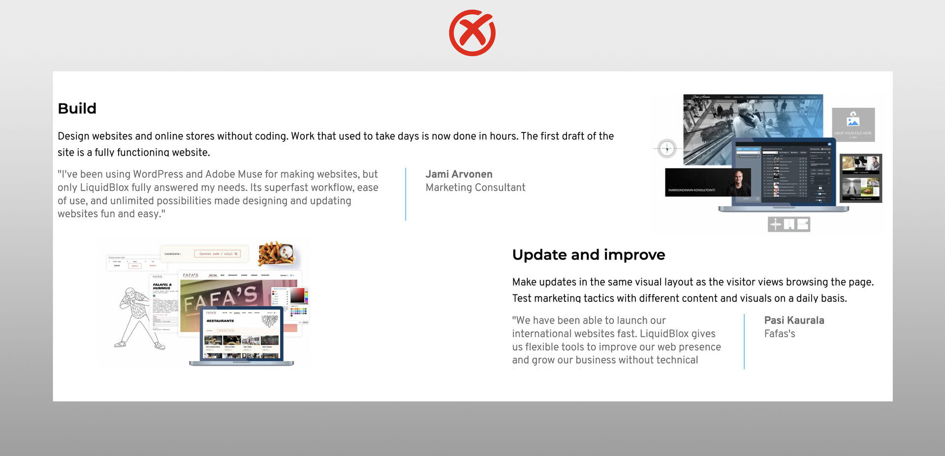
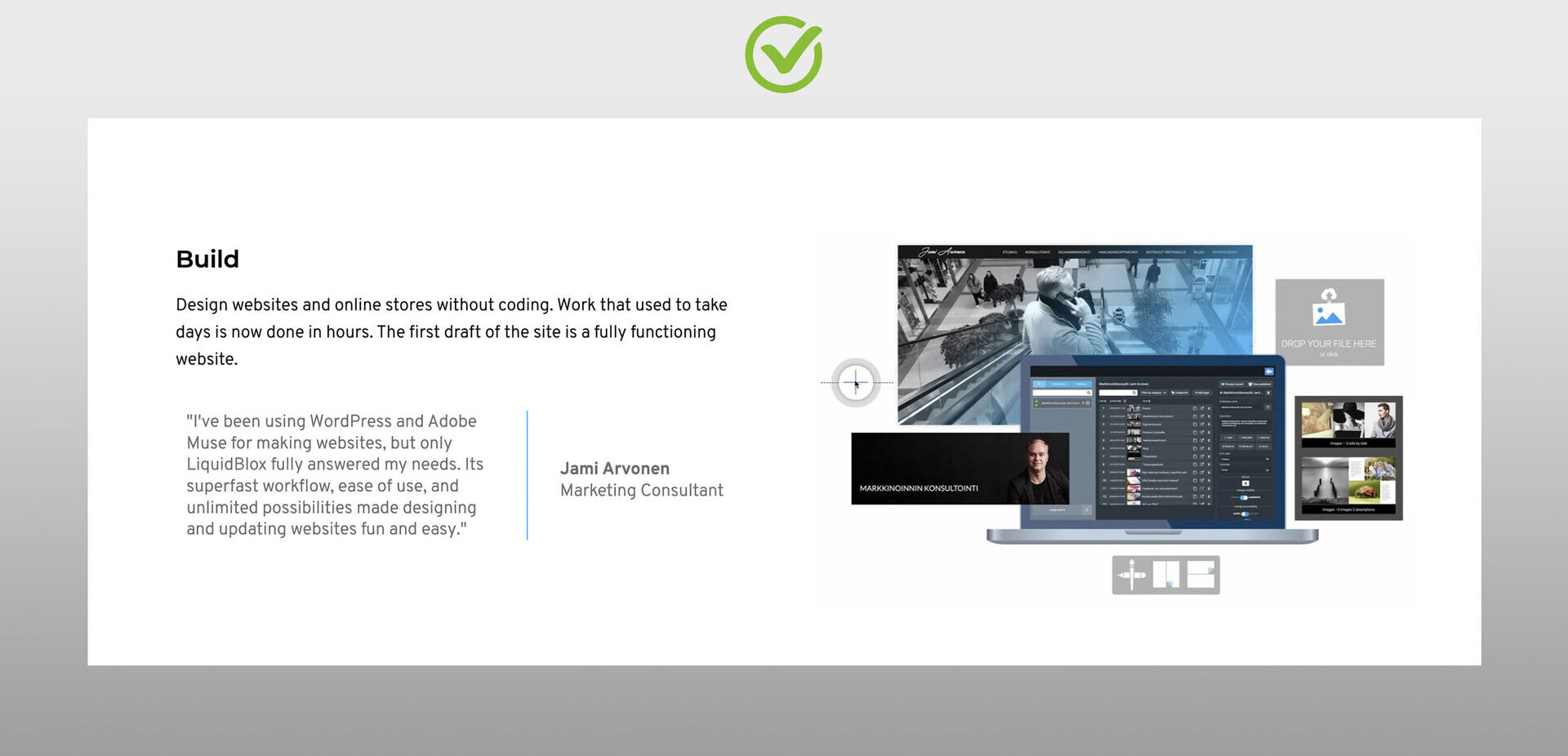
Using white space - Do not cram the page!

Graphic designers have been used to filling up expensive space, like in newspaper and magazine ads. In print, the area is limited, but there are many ways to get some more real estate and extra space on the web:
The page can increase in length to infinity.
Content can be placed on multiple pages.
You can use expandable content areas, such as carousel elements to provide more content within defined spaces. This is especially important in designing mobile versions to avoid long pages that need endless scrolling.
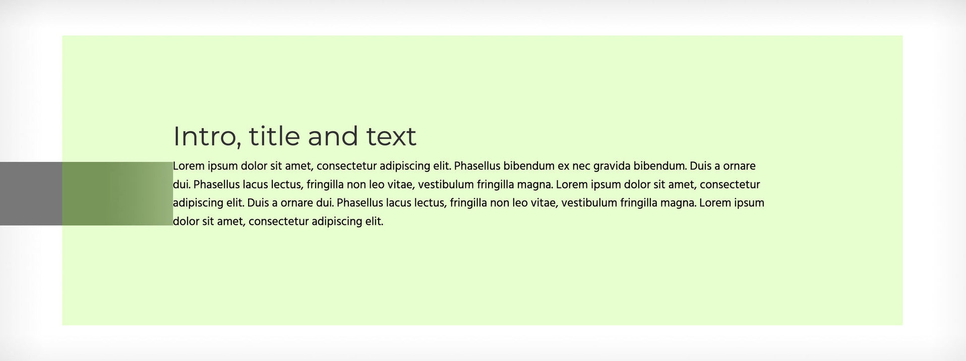
The terms for white space in web design are padding (for internal white space) and margin (for external white space). Padding is the right solution if you want to add a background color to an element with empty space before other types of content like lines of text.
MARGINPADDING
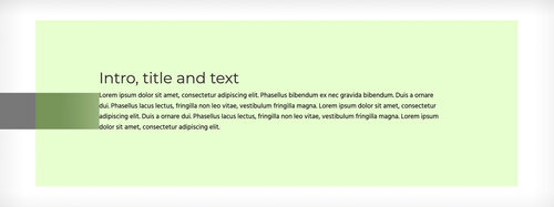
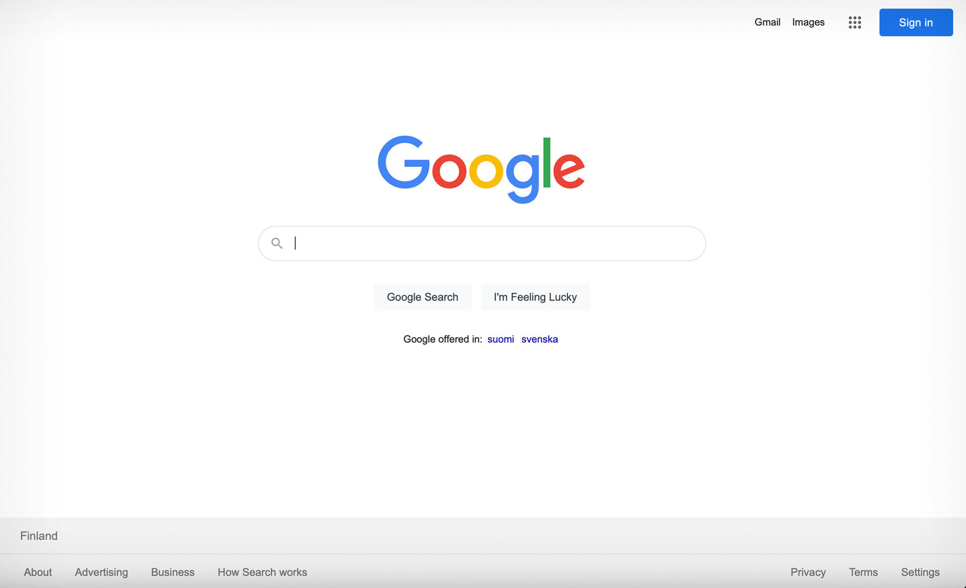
A good example of white space usage is Google’s search page. White space literally makes the page a pleasure to view and use.

The Rule of Thirds
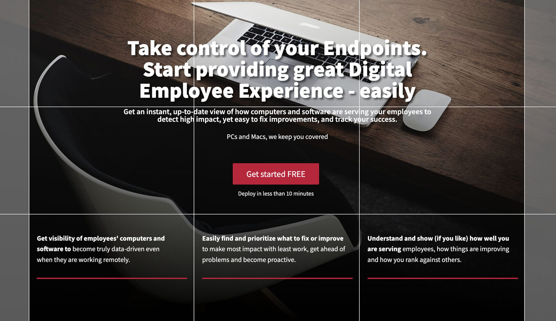
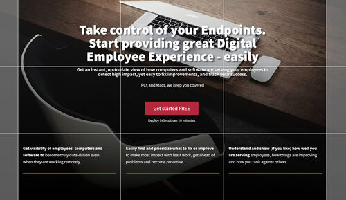
The rule of thirds, which divides the viewed area into nine equal parts, works well in web design. Admittedly, the application differs only from the usual ones due to the responsiveness of websites. Either the whole screen, or just a single element, can be considered as the focal area for the rule of thirds.
The images below show just how to utilise the rule of thirds in a website hero banner, which is typically the main element in a web page. The idea is to align content elements or their edges inside, on the edges, or over the rule of the third grid. This way, the composition always works nicely.


Below is an example of using the rule of third with three featured elements in three columns.

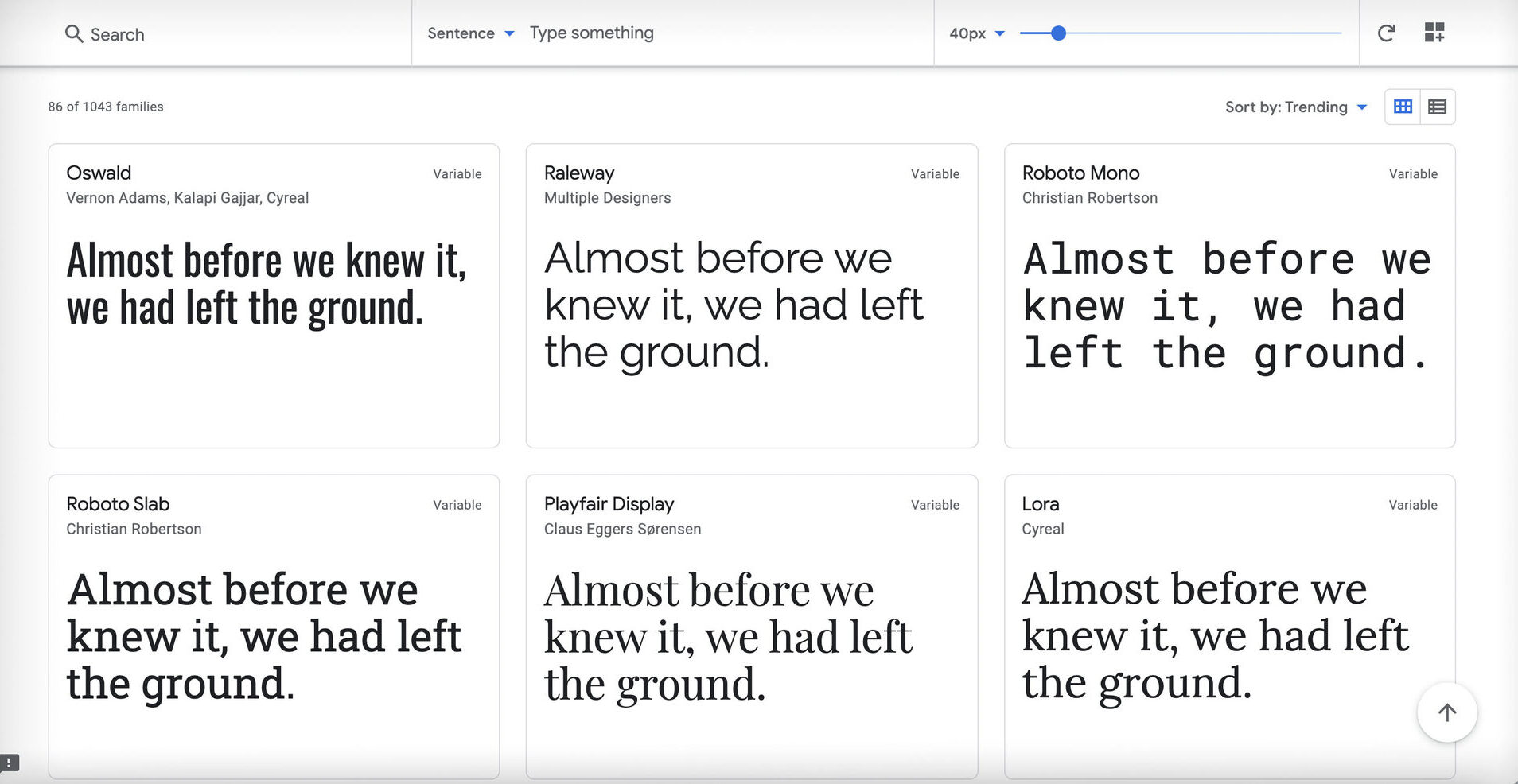
Typography and Use of Text
Online, fonts are used and combined in the same way as in graphic design in general. Dynamics can be created by combining different well-matched fonts. The limitation is that the internet by default uses one type of paragraph text and a maximum of six heading fonts H1-H6.
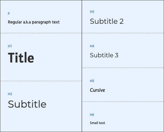
It is also important that the hierarchy of titles is maintained throughout a given design and layout. The topmost title of the page will use the H1 style, the first sub-header is H2, etc. If the hierarchy is broken, it affects search engine visibility in a negative way.
All fonts work online with OTF or TTF file types. However, many paid fonts require a second license for online use. If you don't have a specific font defined for your project, I recommend checking out the free and well-functioning Google Fonts and choosing an option that works for your project.

Responsiveness may cause some gray hair for graphic designers. Word placing in lines is precisely defined in print, but online, the lines should live their own lives. As the device size decreases, there will be more rows. Forced line breaks may sound like a good idea on one screen size, but the same line break might not – and likely won’t – work on a screen with a different size.
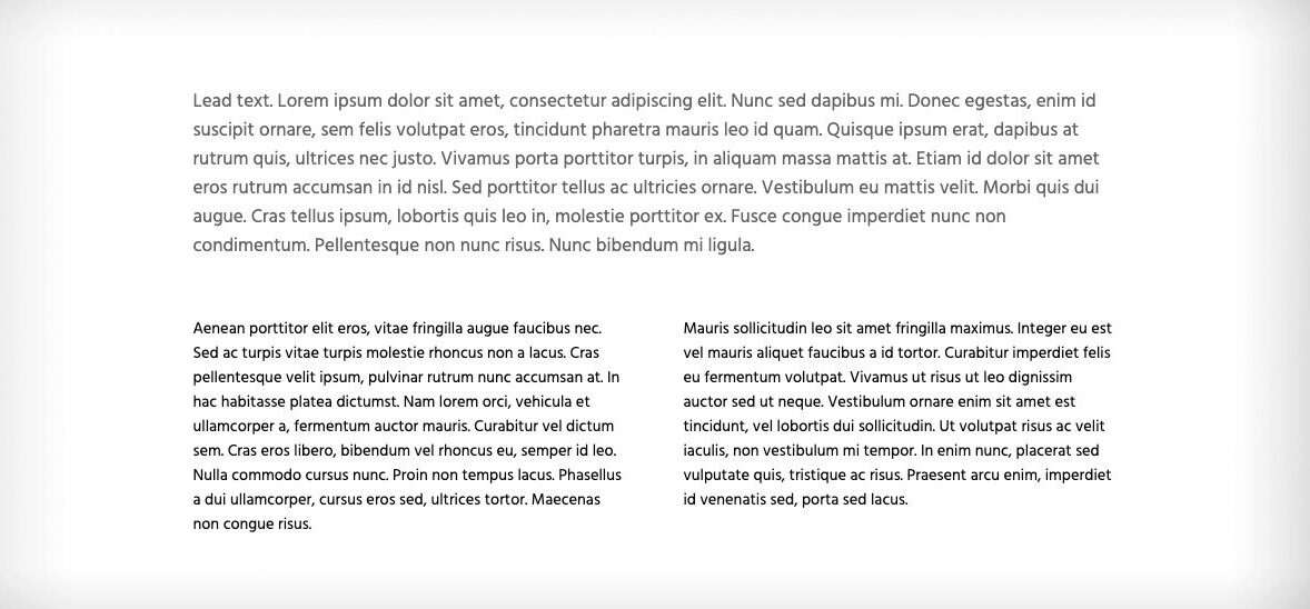
Kerning – Line Height
Kerning, also called line-height in web design, paves the way for designing beautiful typographic elements. By combining the use of white space with the width of the text area and line height, the paragraphs begin to look like graphic design elements. The line height value is typically adjusted per heading or paragraph style, but of course, exceptions can be made to highlight one paragraph.

Alignment
Accuracy of alignment or lack of alignment affects the professional look of a website. Usually, padding and margin values of page elements create invisible lines that align with each other. Alignments have to be designed separately for a computer browser and for mobile devices.

RGBA
Forget CMYK! All web graphics should be saved in RGB colors for images to look the way they should. Colors are typically defined in HEX format or RGBA format. In the latter, the letter A stands for alpha channel, which defines the transparency of a color. Zero is completely transparent, and value one has no transparency at all.
Size Matters
Someone may have snorted at the poor quality of the images in this blog. I'm telling a secret: I saved the images at a slightly better resolution than I normally do, just for my audience. Of course, high-resolution images look good, but the size of the image also affects the page load speed. Fast download speed, on the other hand, improves the user experience and Google's appreciation, which ultimately improves search engine visibility.
A suitable compromise must be found between the image quality and the file size. Personally, I saved the images for this blog with Photoshop’s Save for Web feature to 80% quality at an image width of 1500-2000 pixels. On mobile, I rely on the system’s own image resize feature, which makes images 500 pixels wide. Photoshop's Save for Web feature also names images to suit web usage – again, an SEO thing :)
Summary
Here are the most important tips for starting web design with a graphic design background. We are spending more and more time online, which has become like a living room for modern people. We decorate our living spaces to meet the eye, so why couldn’t our virtual living room also be beautiful and functional?
All of the techniques mentioned can be easily tested with LiquidBlox, the no-code website builder for designers.
Read more about doing website design professionally here.